Supwell
“The app doesn’t look broken anymore.” — Yowana Wamala, Founder, Supwell
Context
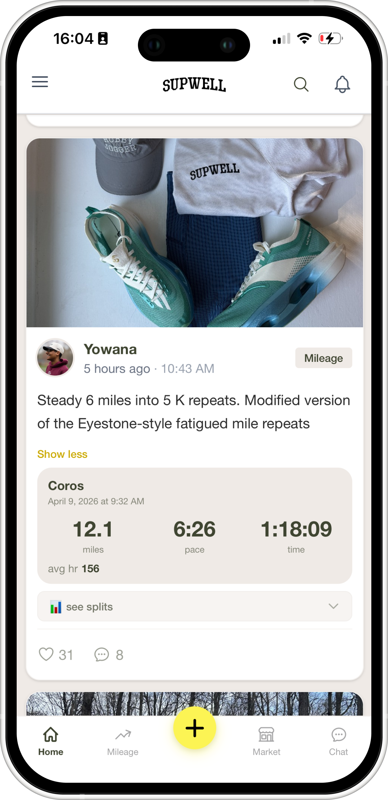
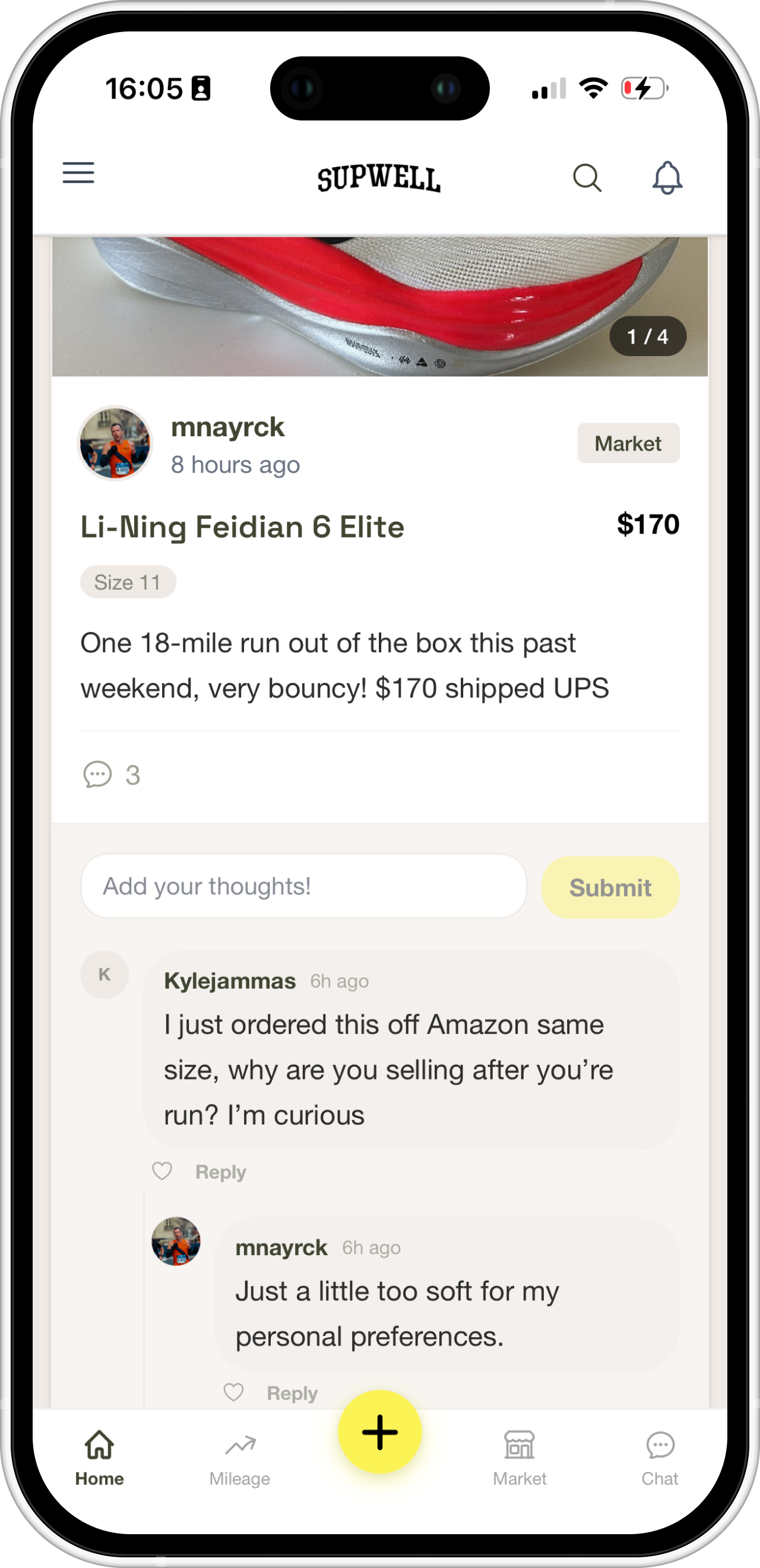
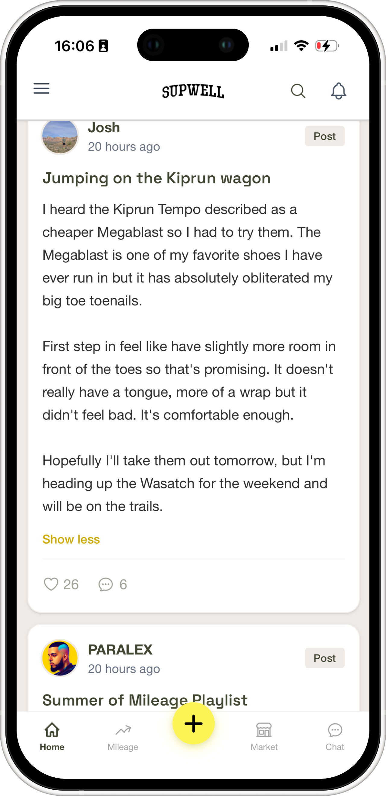
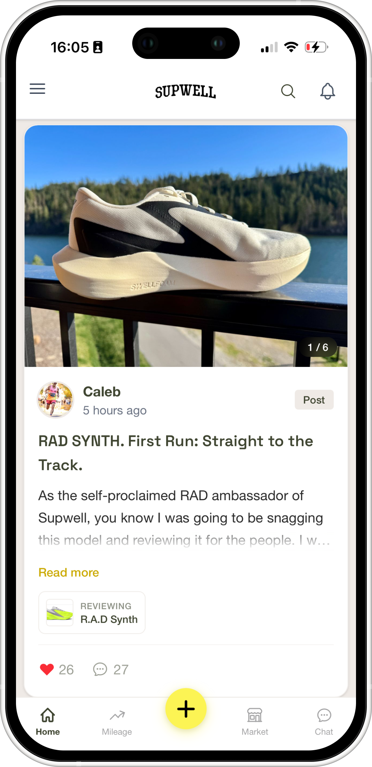
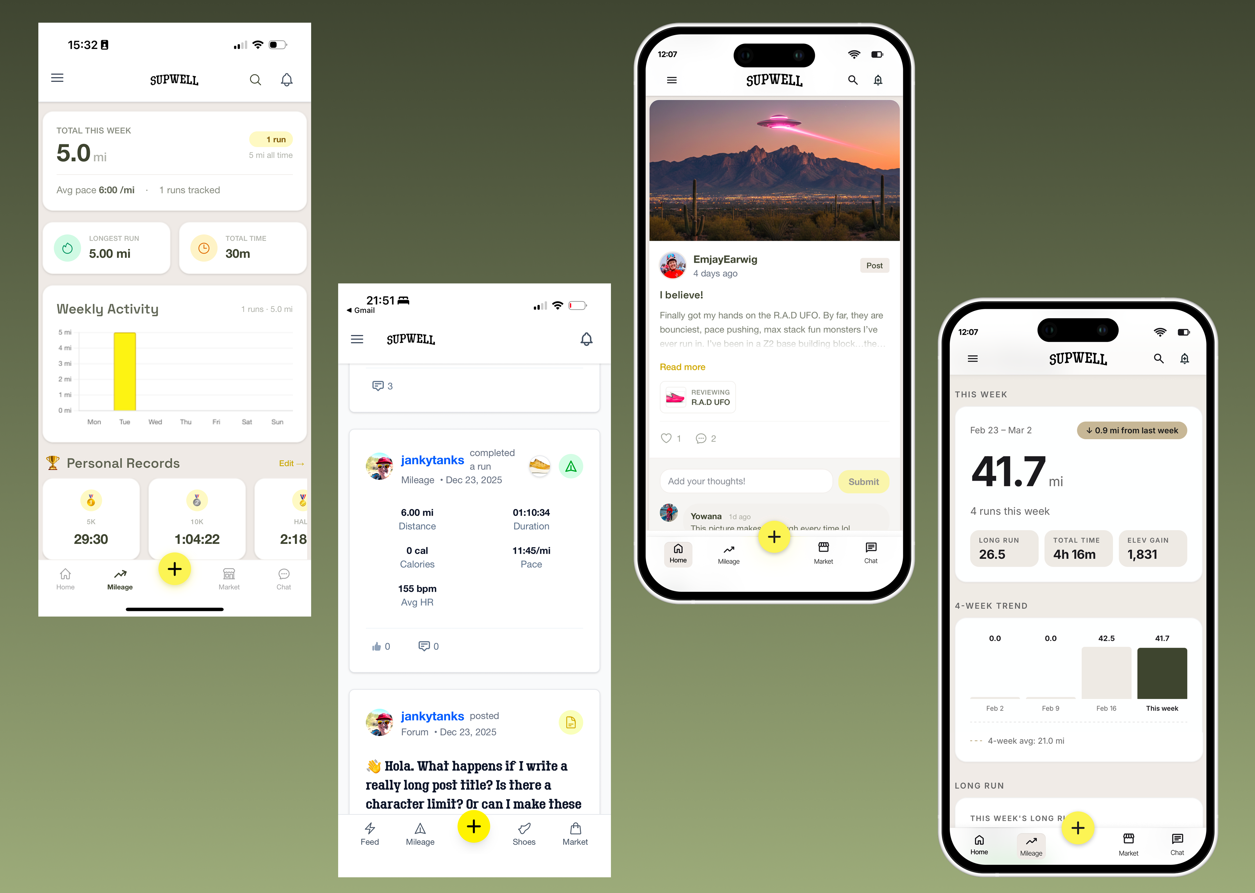
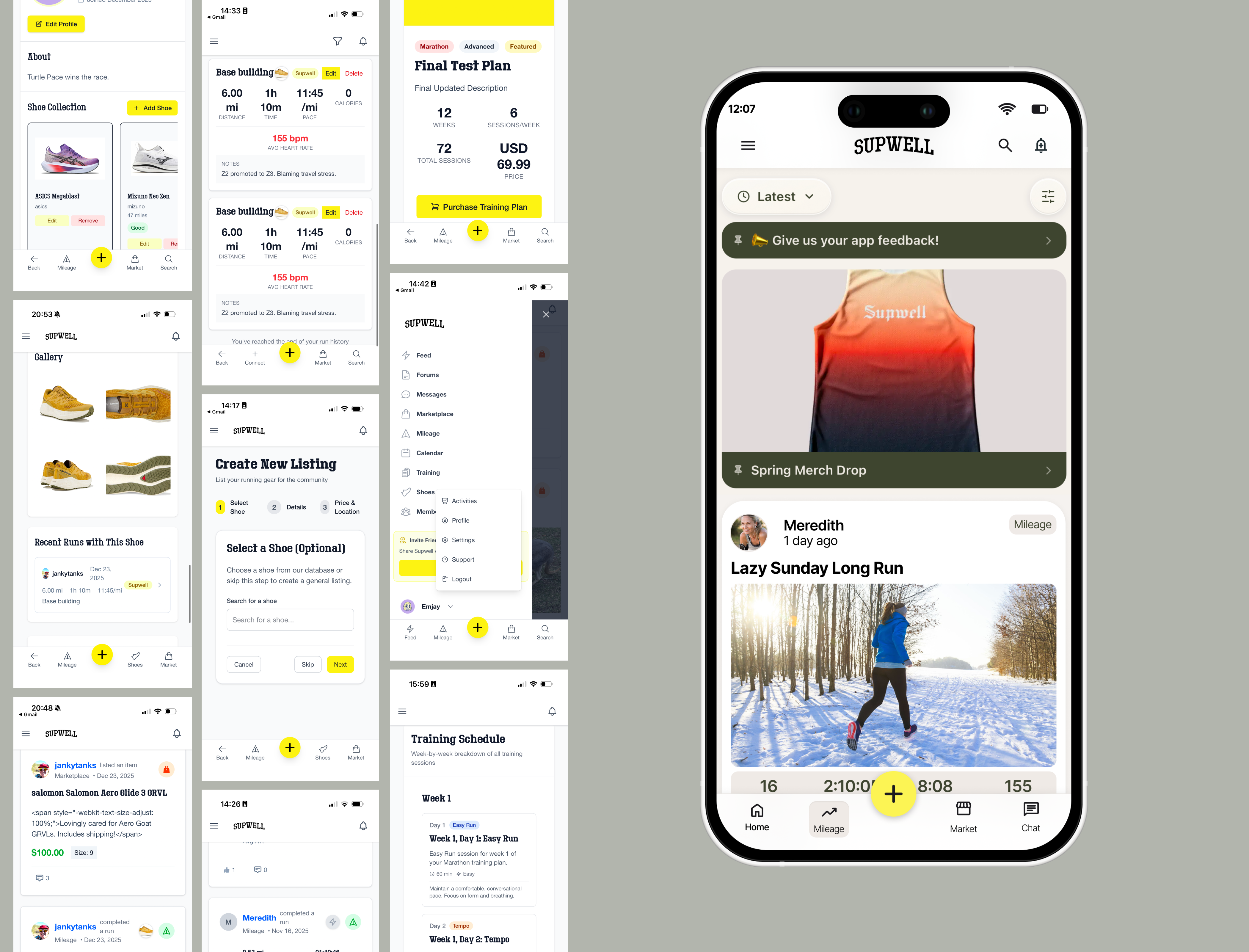
Supwell is a running community app — shoe tracking, social feed, and a peer-to-peer marketplace for used running gear. The founder builds in public, sharing development progress with an active beta community in real time.
What This Shows
New user empathy catches what specialists miss. The people closest to a product stop seeing what a first-time user experiences. Naming the problem precisely — not just flagging that something feels wrong — is what turns feedback into action.
The Problem
Nobody could name what was wrong. The founder knew something felt off. The engineer thought it needed polish. A pre-recorded demo was already in the can.
The real issue was structural. Every screen had been designed in isolation. Nav labels changed between pages. Card treatments were inconsistent. The app was simultaneously trying to be a marketplace, a social feed, a training log, and a shoe tracker — with no hierarchy between them.
It didn’t need polish. It needed an editorial decision about what mattered most on each screen.
The Intervention
I wrote a precise UX brief. Not a complaint — a diagnosis. It named the hierarchy problem explicitly, proposed a clear information architecture for each screen, and gave the engineer something to act on rather than defend against.
What Happened
The redesign shipped. The founder cut the broken demo segment from a pre-recorded video rather than showcase the old design. Yowana described the result without prompting.
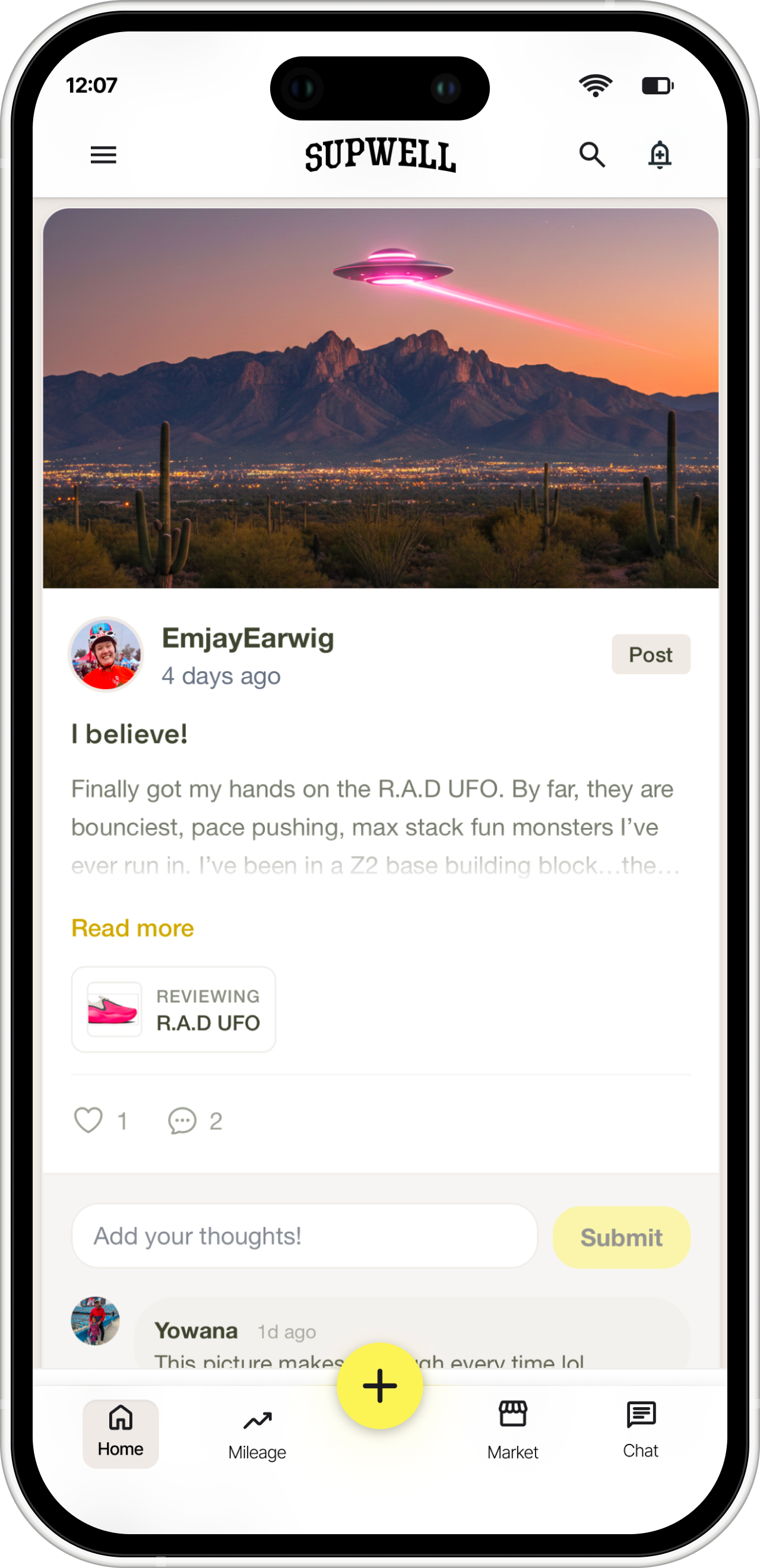
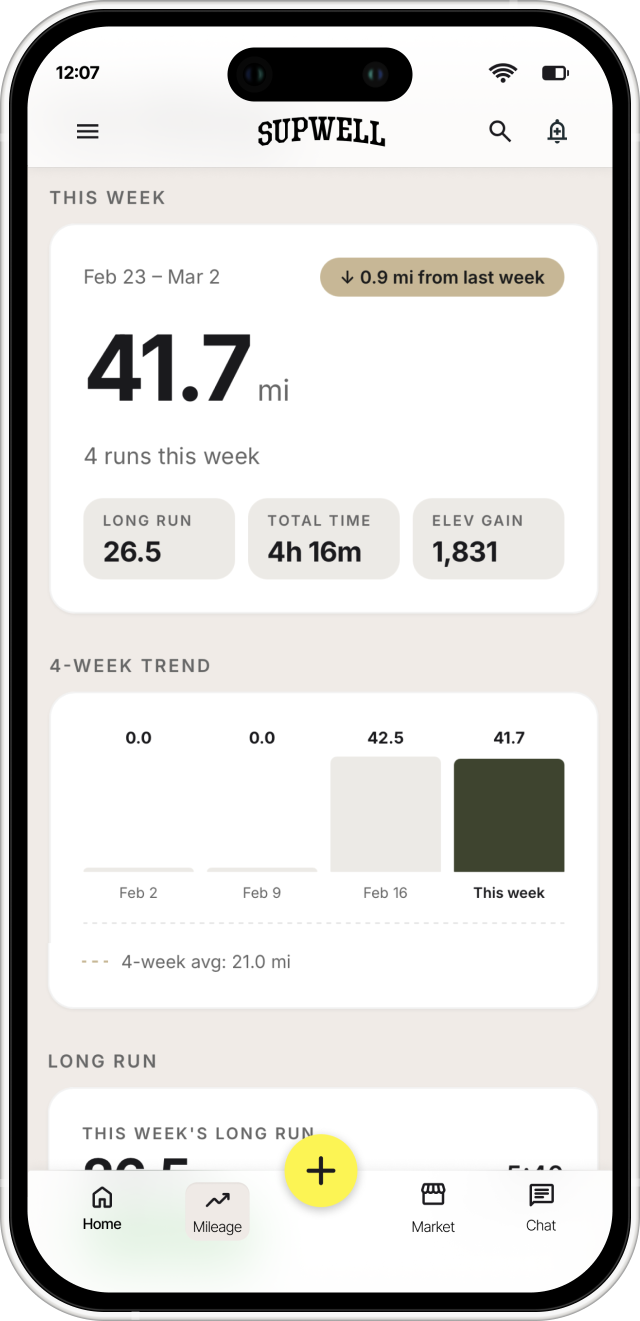
The app is now live in the App Store with an active community posting runs, reviews, and gear listings daily.